A brand identity reflecting evolution and adaptability
In their quest for a refreshed brand identity, We Are Them Films entrusted me with a visual representation that embodied their dynamic and contemporary approach. The result is a logo crafted with a custom typeface that reflects the company's core values: simplicity and modernity.
We Are Them Films is an international production company with offices in London, Madrid, and Valencia, dedicated to delivering personalized, honest, and high-quality experiences to its clients. With over 20 years of experience in both national and international markets, their directors have been recognized at prestigious advertising festivals worldwide, including Cannes, One Show, El Sol, Clio Awards, and the London Festival. Their expertise encompasses a wide range of projects, from storytelling and slices of life to fashion films and tabletop productions.
Key elements of the brand design
Custom typography: The bespoke typeface used in the logo conveys a clean and modern aesthetic, aligning with the company's commitment to staying current and adaptable in a rapidly changing industry.
Simplicity and modernity: The minimalist design approach ensures that the brand's visual identity is both straightforward and contemporary, effectively communicating their dedication to quality and innovation.
Versatility: The adaptable nature of the logo allows it to seamlessly integrate across various media platforms and formats, ensuring consistent brand recognition in diverse contexts.
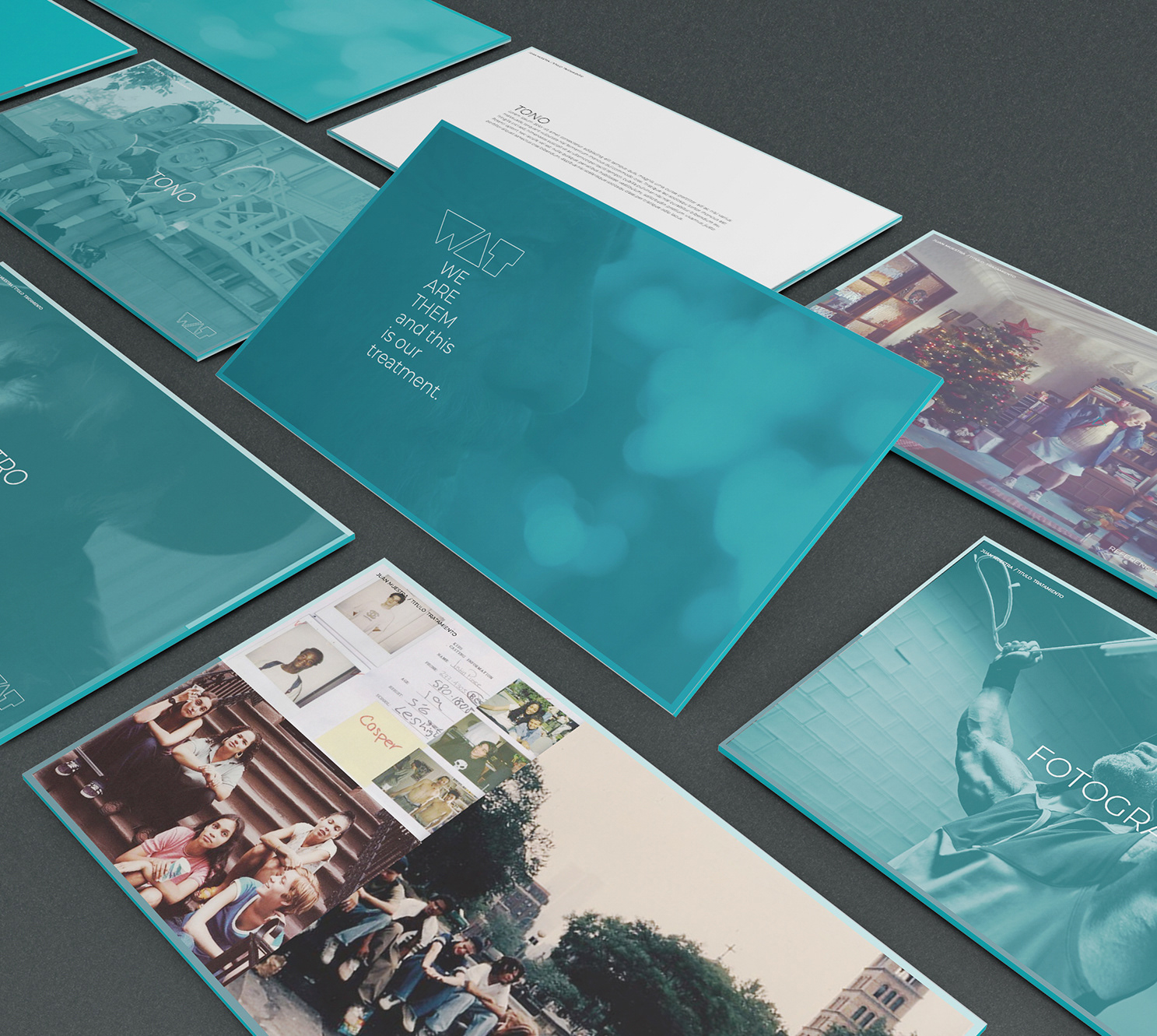
Through this thoughtful rebranding effort, We Are Them Films successfully captures the essence of their progressive vision, reinforcing their position as a forward-thinking entity in the film production landscape.