
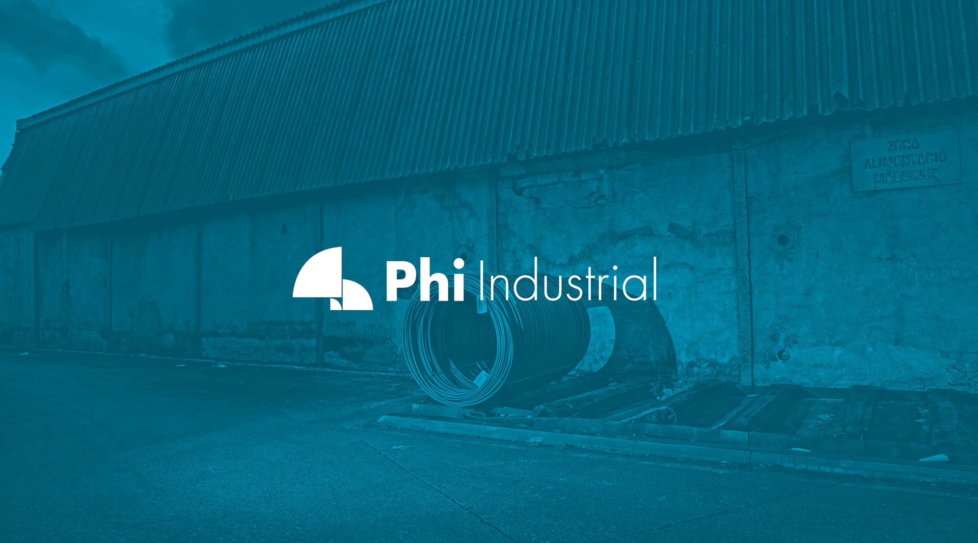
PHI Industrial is a private equity firm specializing in the industrial sector, recognized for its focus on acquiring and revitalizing companies in special situations. With a track record spanning multiple acquisitions and a significant presence in Europe, PHI Industrial has established itself as an active investor committed to the long-term sustainability of its portfolio companies.
A redesign that balances modernity and legacy
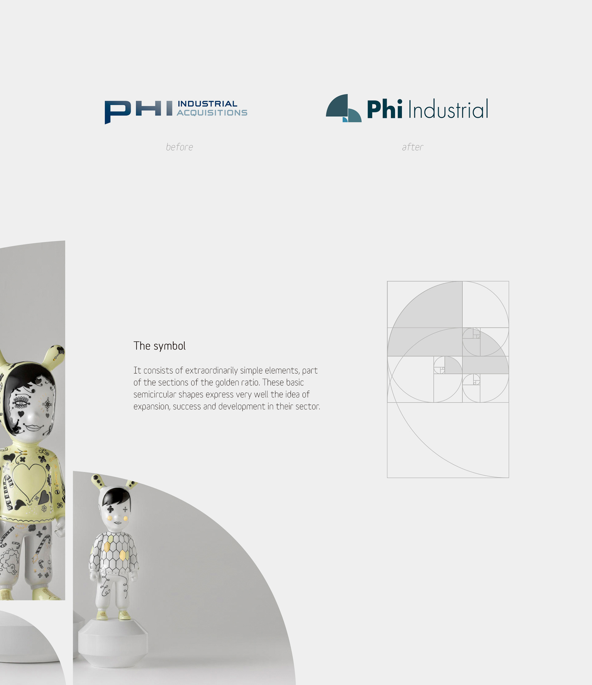
In this rebranding process, PHI Industrial enlisted me to develop a visual identity that reflected both the company's modernity and legacy. The main objective was to merge simplicity and contemporary style without losing sight of the brand's values and history.
Key brand design elements
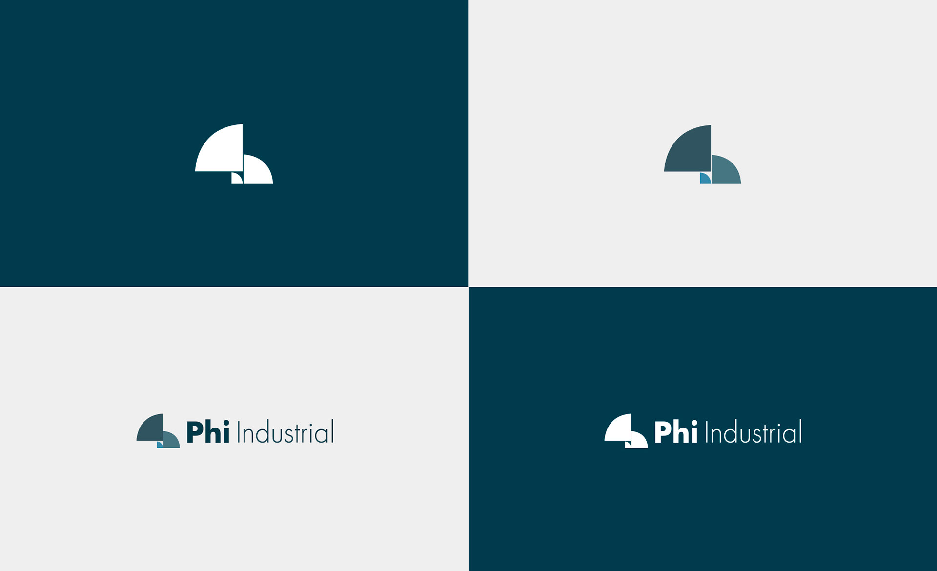
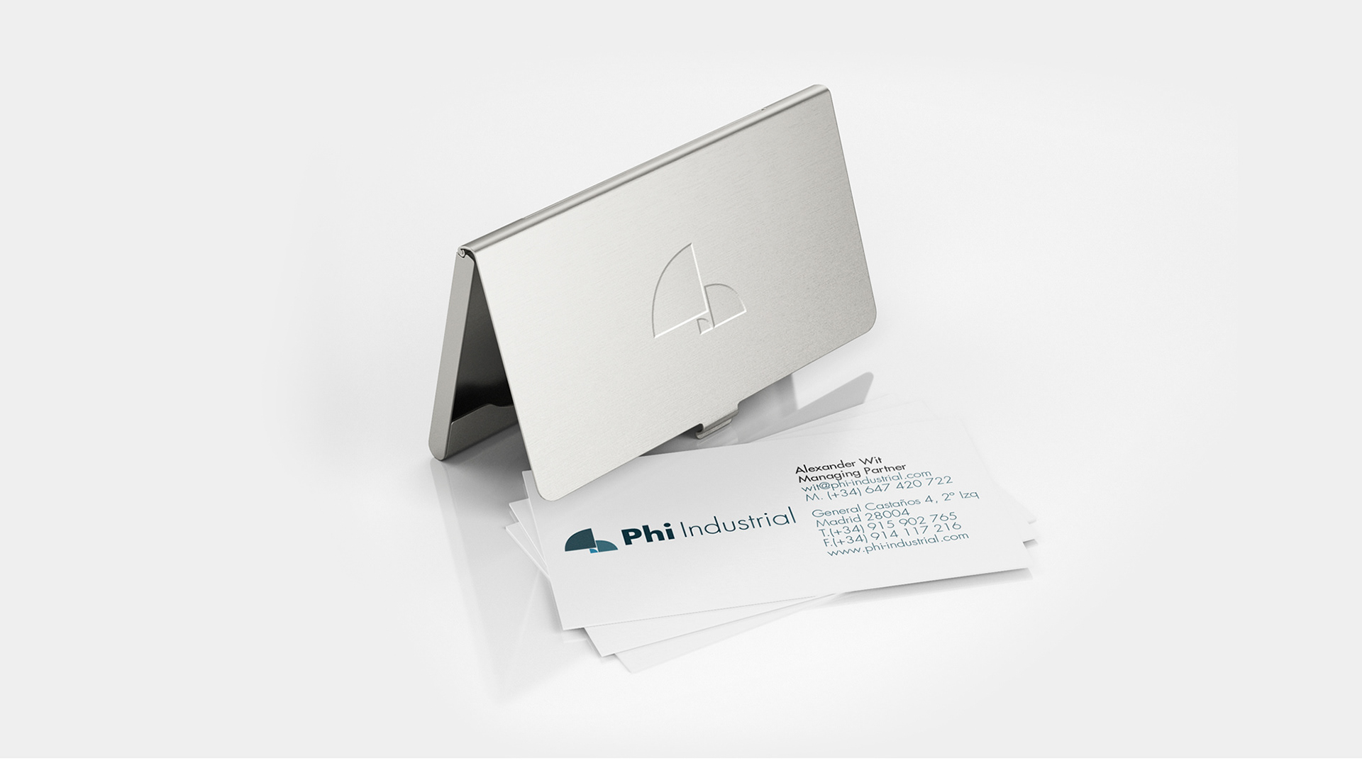
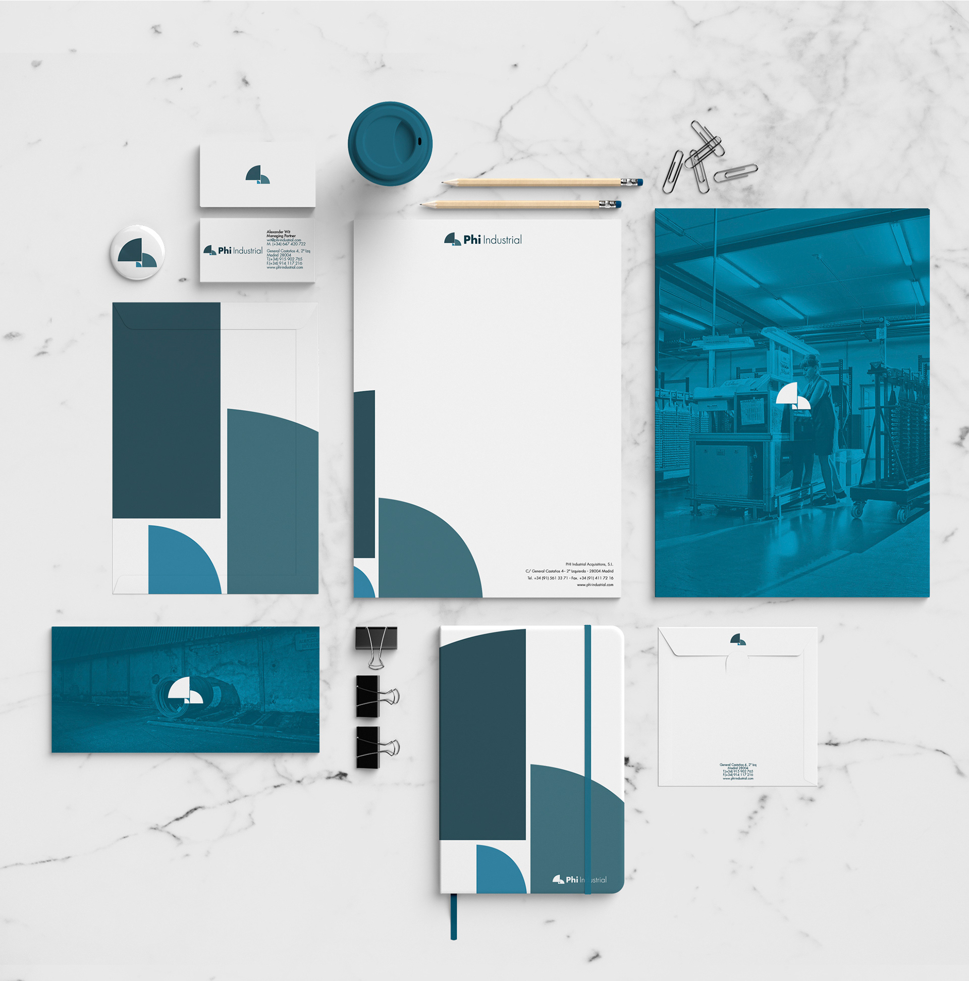
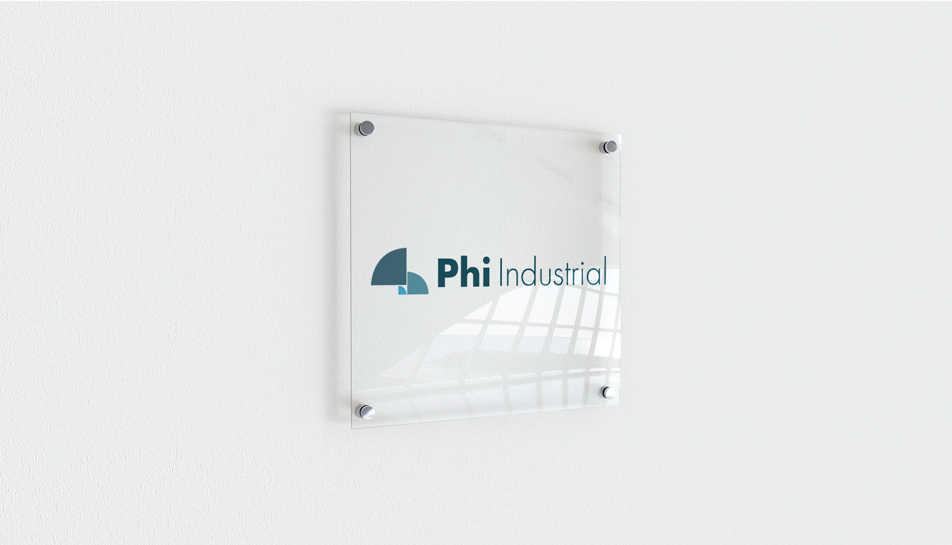
Golden ratio symbol: the new logo is inspired by the number Pi and the golden ratio, mathematical elements that symbolize perfection and balance. This choice not only provides a harmonious aesthetic but also underscores PHI Industrial's precision and analytical approach to its operations.
Clean and modern typography: the selection of a simple, contemporary typeface conveys clarity and professionalism, aligning with the image of a modern and reliable firm.
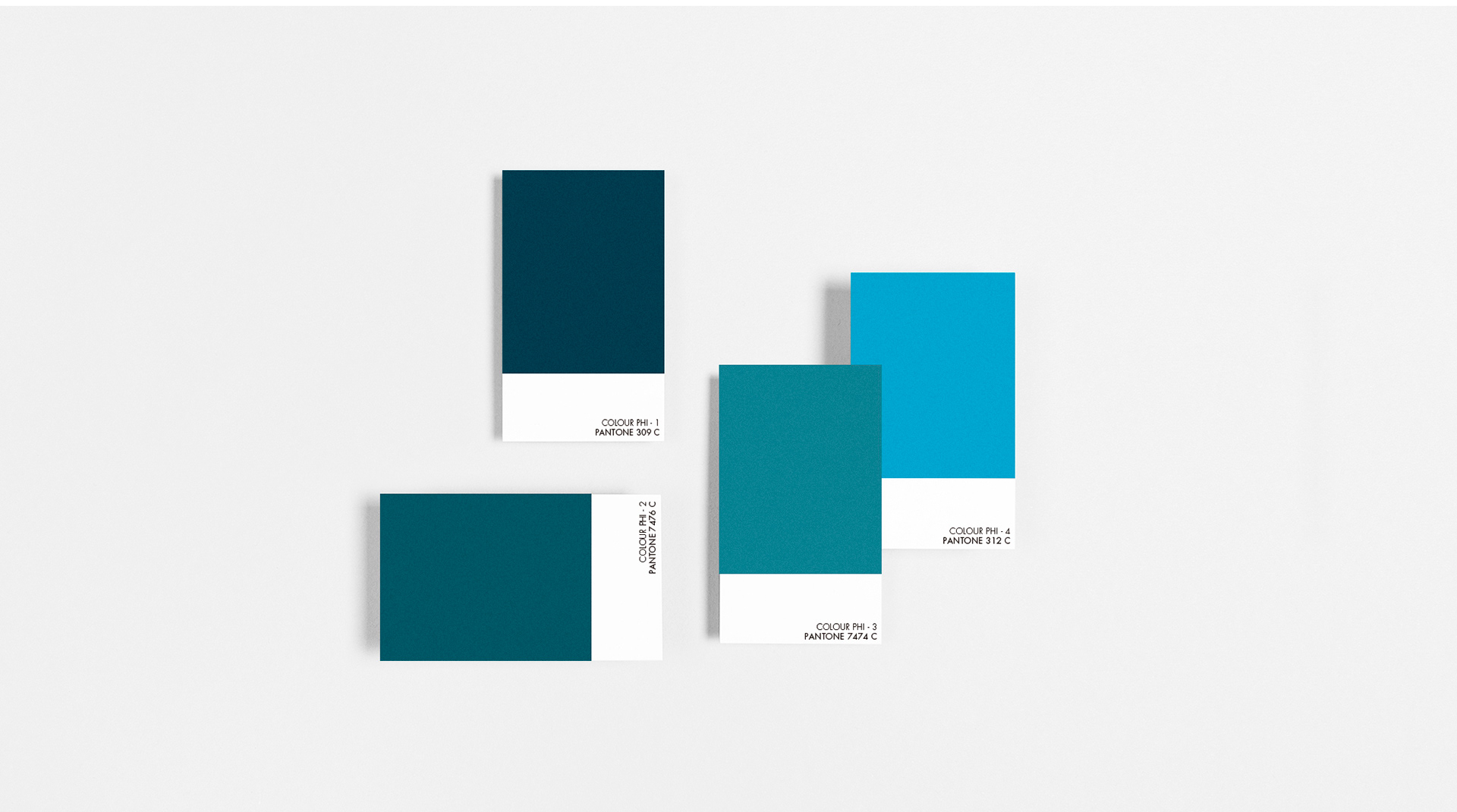
Sober color palette: the neutral and sophisticated tones used in the visual identity reinforce PHI Industrial's seriousness and commitment to excellence in the industrial sector.
This rebranding has allowed PHI Industrial to present an image consistent with its evolution and market positioning, maintaining a balance between innovation and respect for its history.