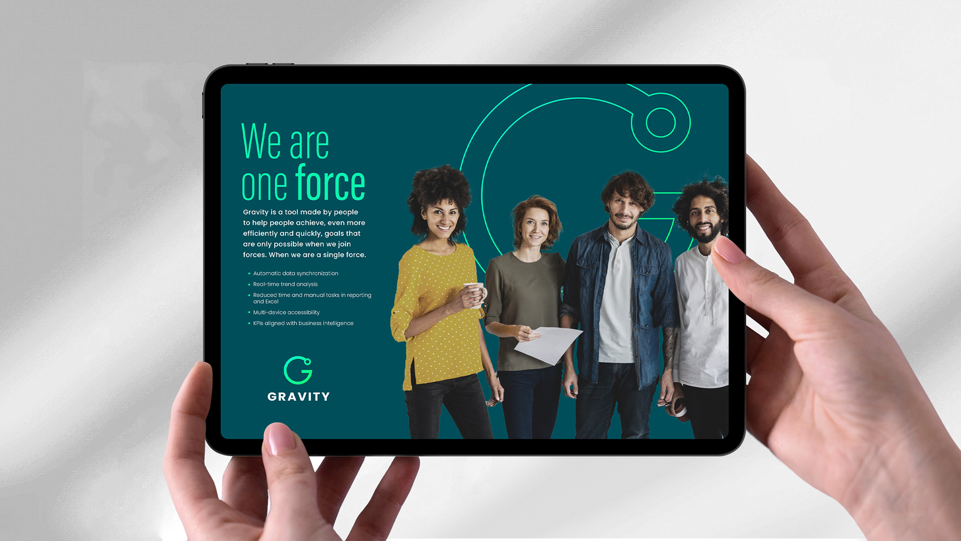

A platform that unites knowledge and people
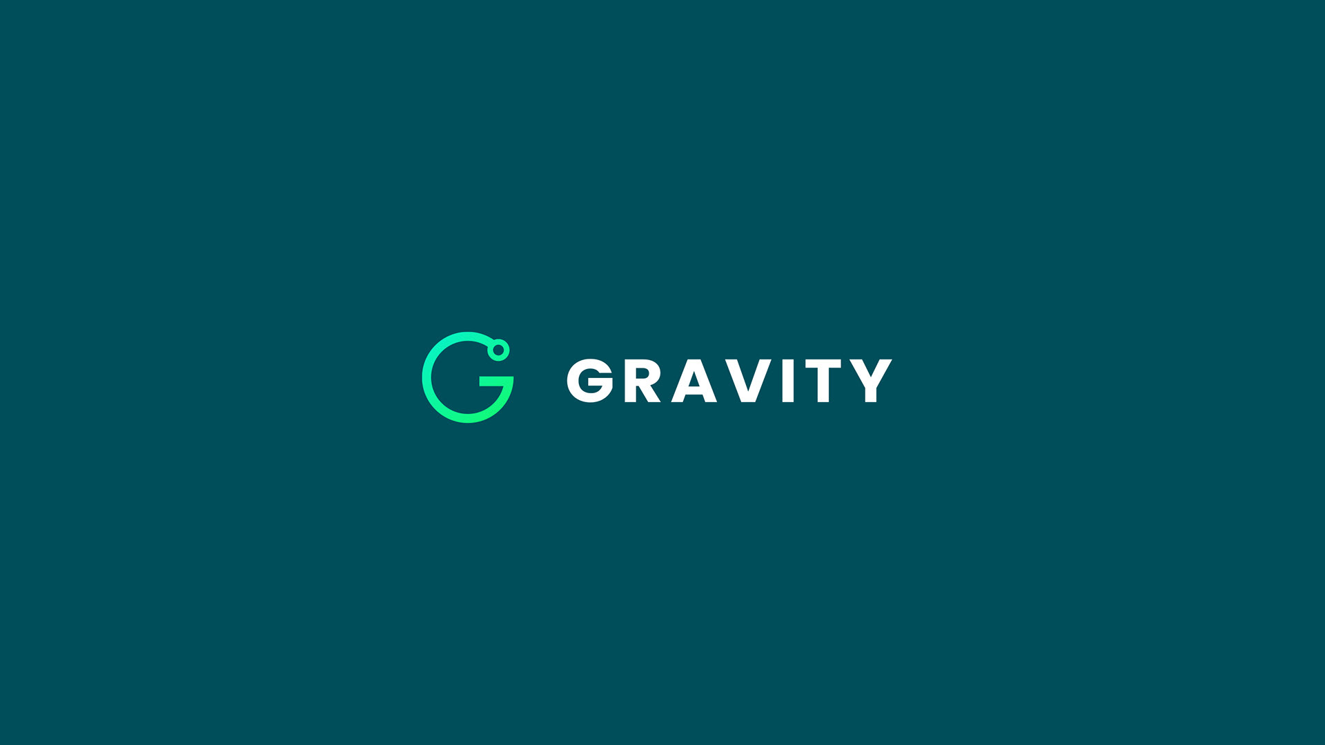
Gravity is a Data Analytics tool and the meeting point where information, technology and talent align to drive smarter decisions in the pharmaceutical industry. Designed to integrate and optimize data into a single force, Gravity connects all employees under one system, making them part of a collaborative and efficient ecosystem.
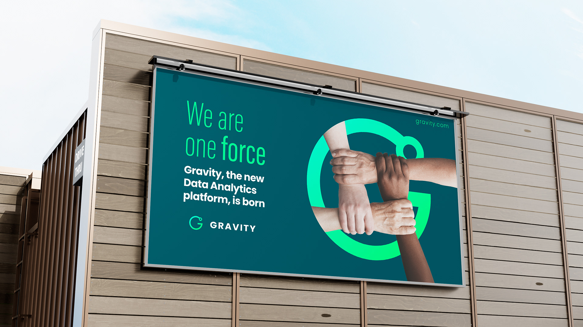
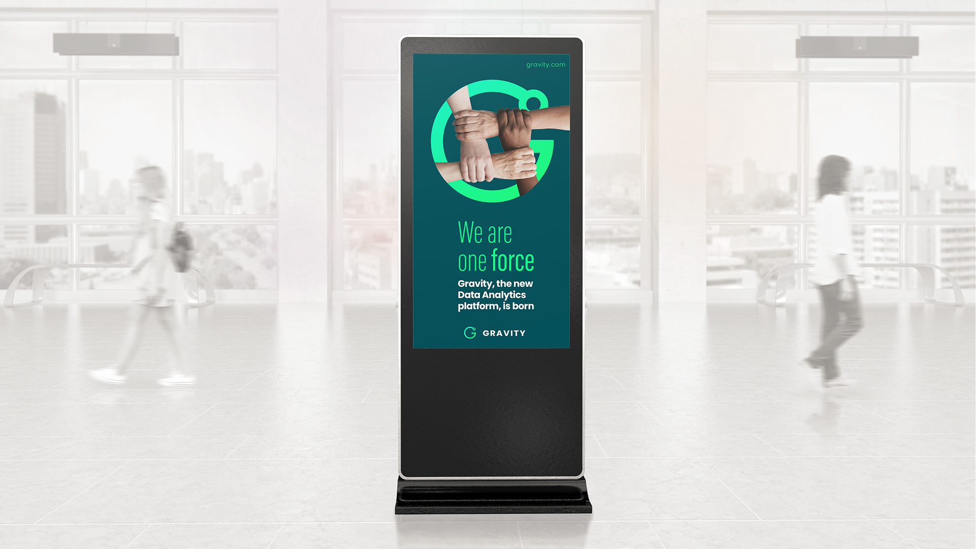
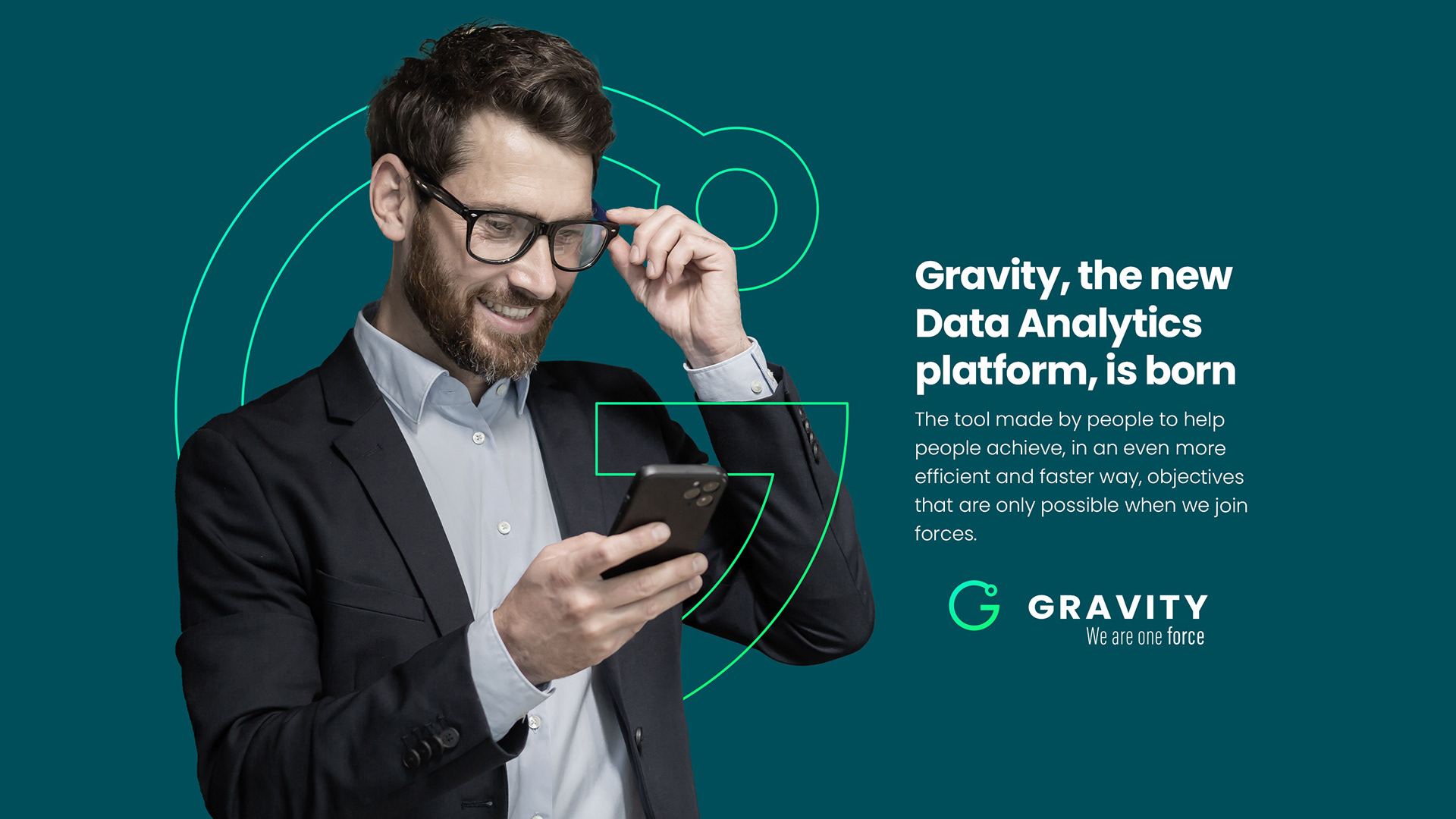
Its claim, “We are one force” says it all: when data flows with precision and clarity, knowledge becomes shared power.

A symbol with meaning
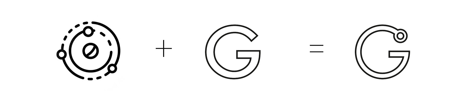
Union of key elements: The symbol is born from the fusion of two fundamental concepts: the “G” in Gravity and the symbol that represents gravity, creating a unique and recognizable identity.
Functional Minimalism: The geometric simplicity reinforces its technological character, ensuring a versatile design for the evolution of the brand in different media.
Visual strength: The result is a logo that conveys solidity, connection and precision, the same values that Gravity brings to data management in the pharmaceutical sector.
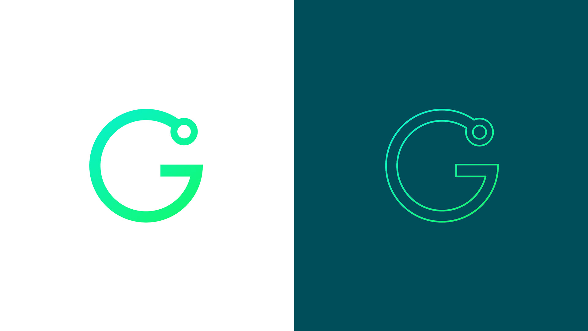
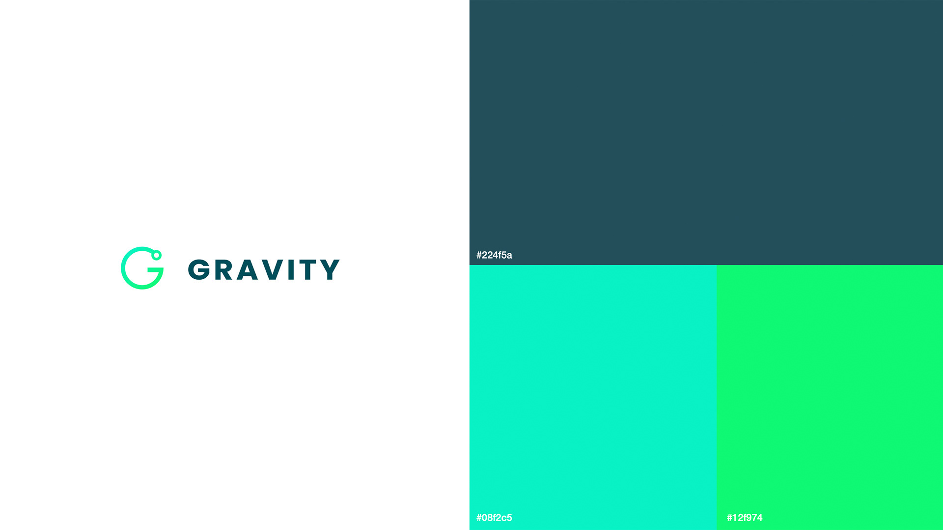
The colors chosen are based on the mother brand but choosing a fluorescent color palette for a more modern and current digital environment.
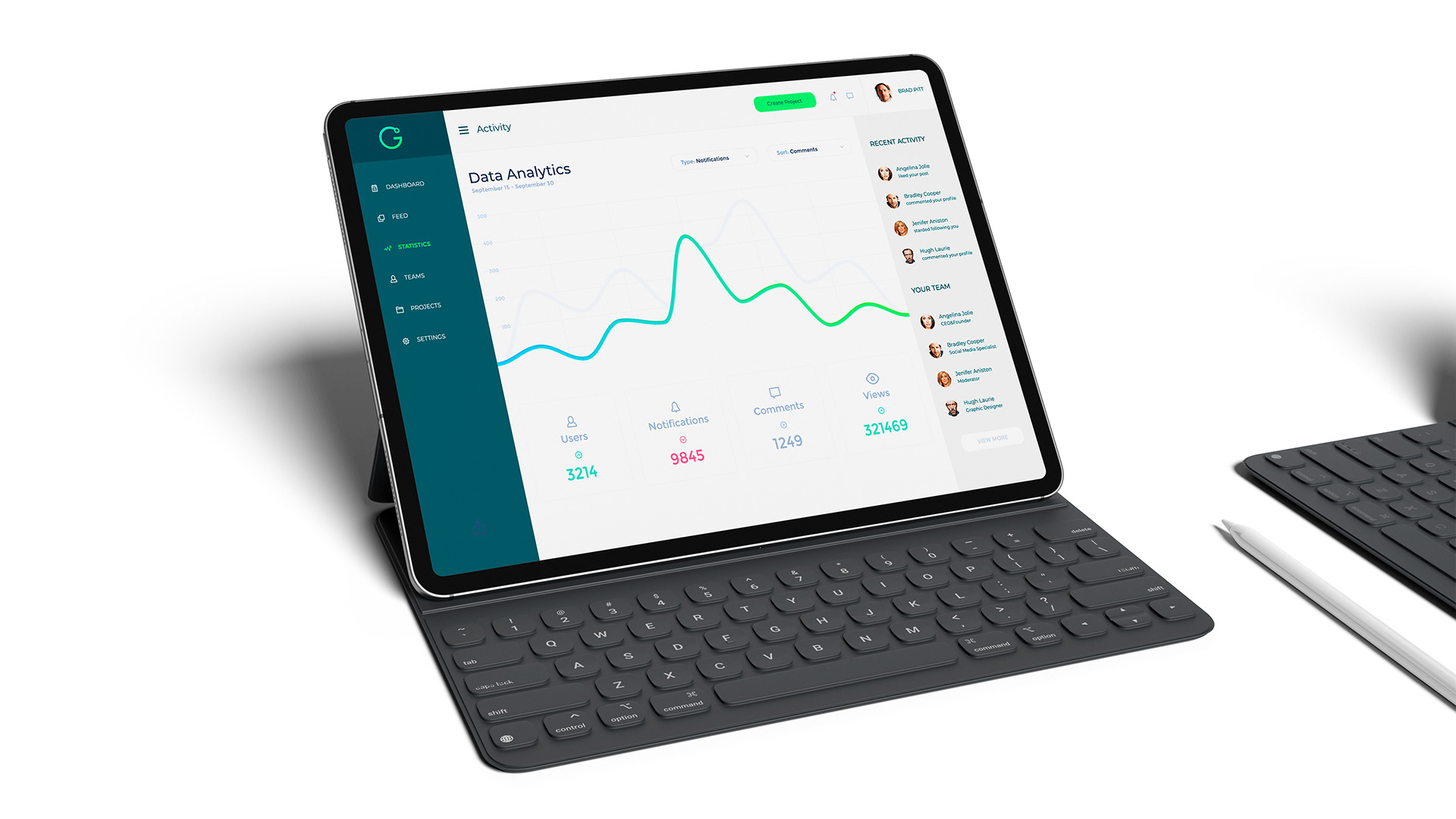
Data, people and technology in balance
Gravity transforms data analysis into an accessible and efficient experience. Its visual identity and message reinforce a clear purpose: to align teams, centralize information and empower decision-making in a single direction.
At Gravity, data is analyzed and becomes the force that drives the future. Because when everything is connected, we are one force.