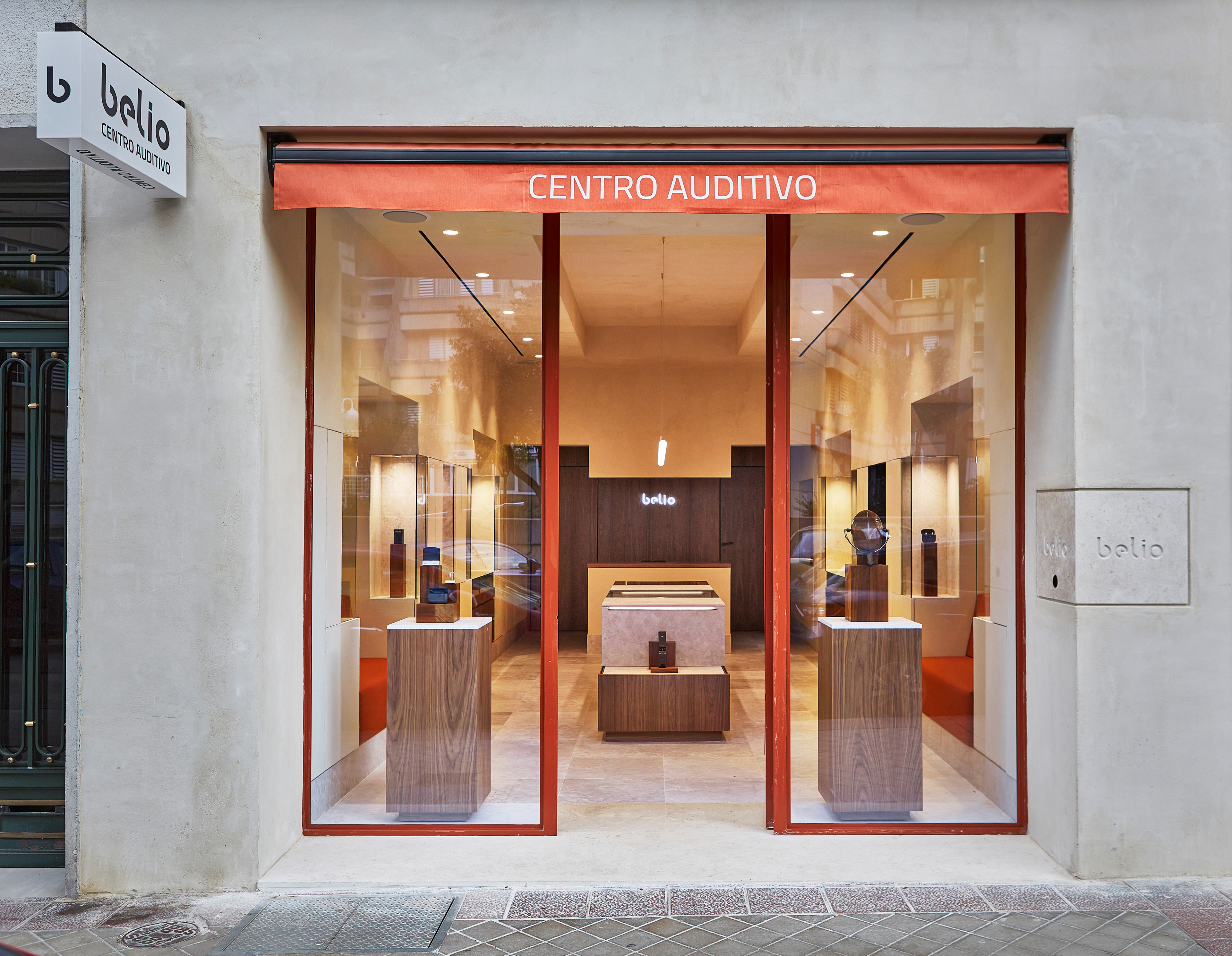

Beyond a brand: redefining the hearing experience
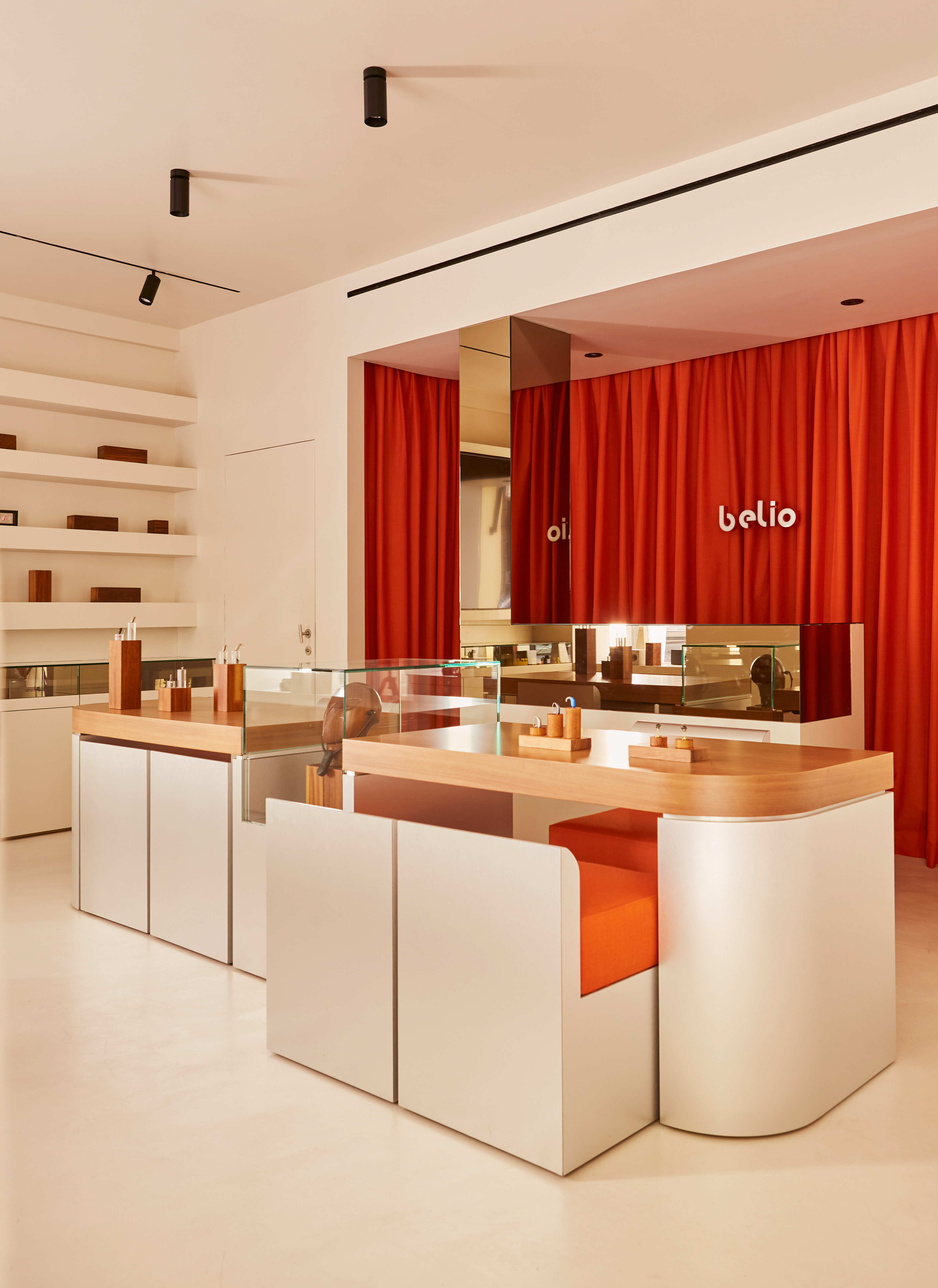
Belio is a hearing center and it is a concept that transforms the way people perceive hearing. Its approach combines advanced technology with a design for those seeking clarity, comfort and barrier-free service.
From its name to its visual identity, Belio communicates accessibility and modernity without losing elegance. A brand that does not impose, but accompanies.

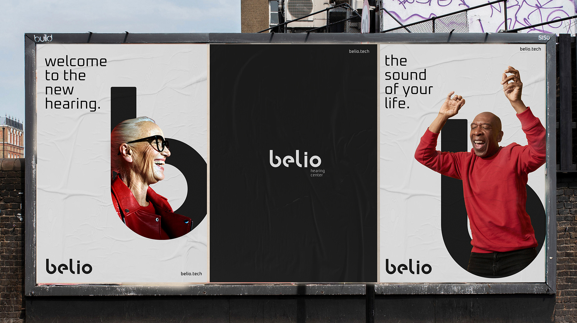
“Welcome to the new hearing”
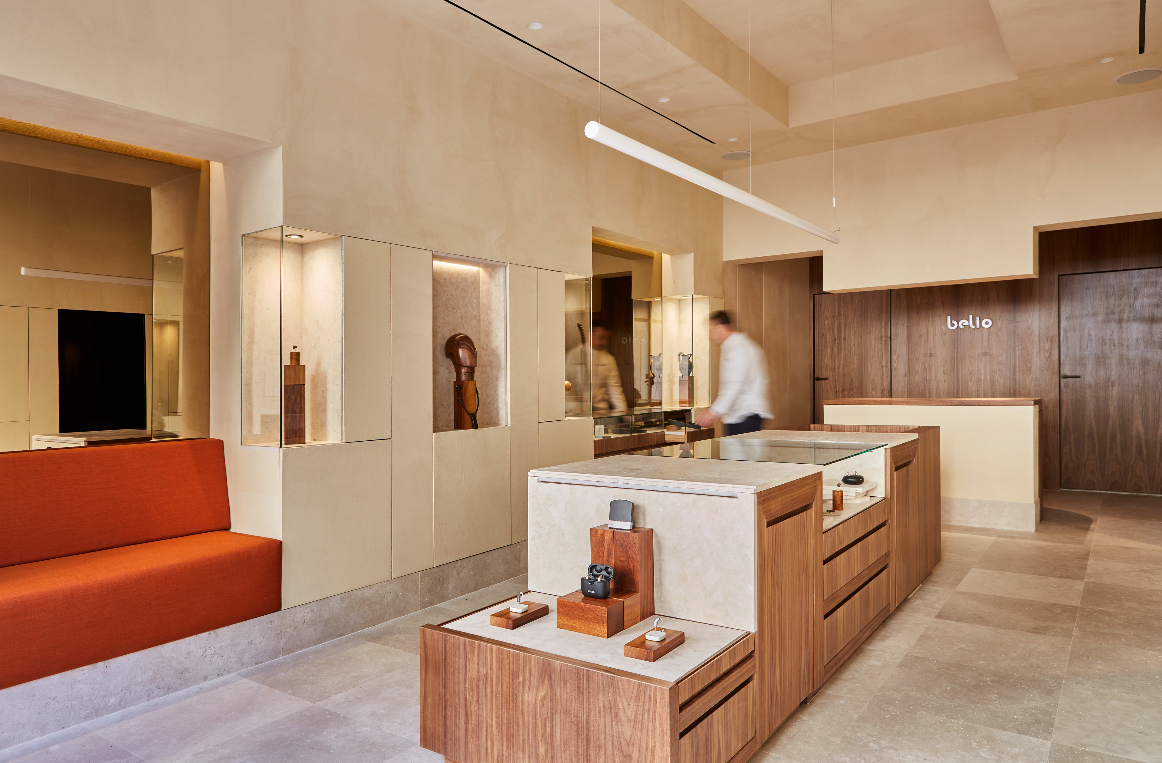
Belio redefines the hearing experience. It's an invitation to discover a world of sound without limitations, where technology and design work together to deliver a solution that feels natural, intuitive and elegant.
Belio doesn't just offer hearing aids, it offers a new way of listening to life.
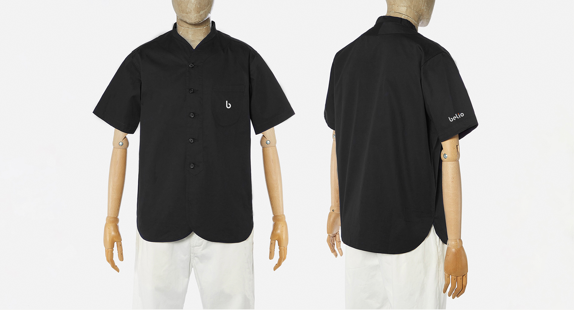
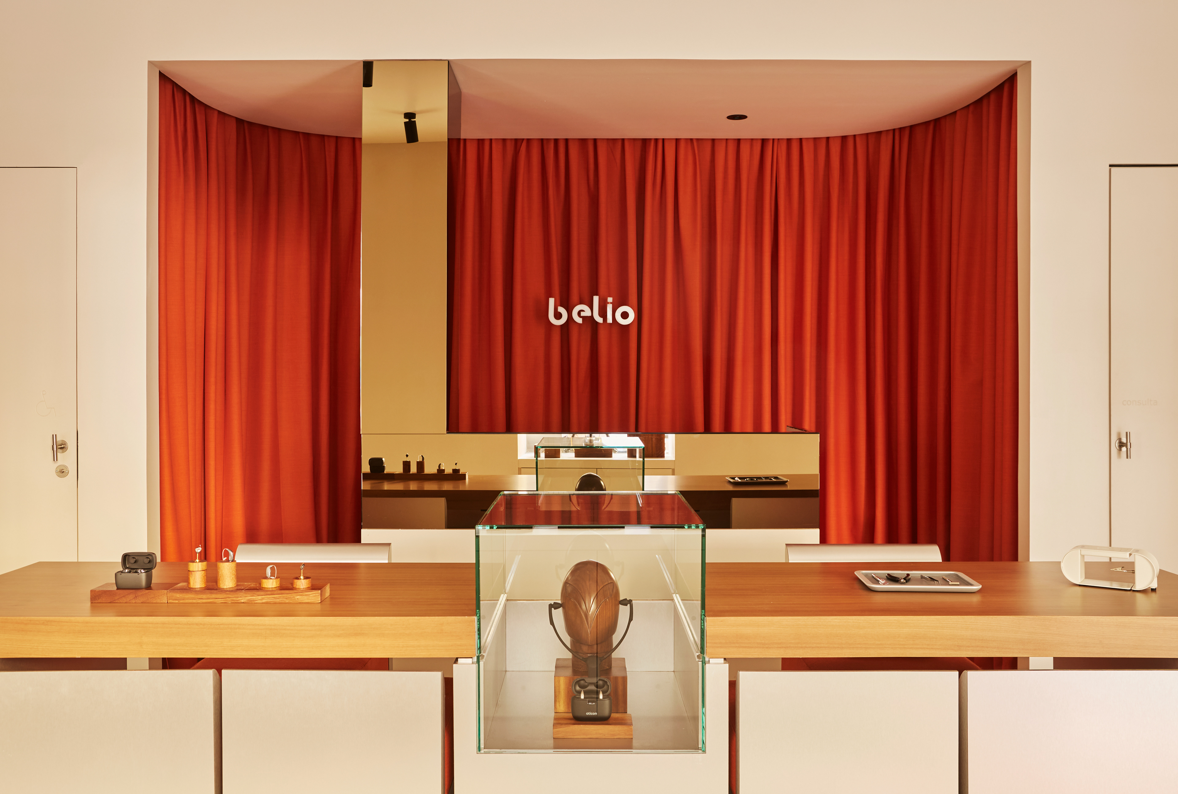
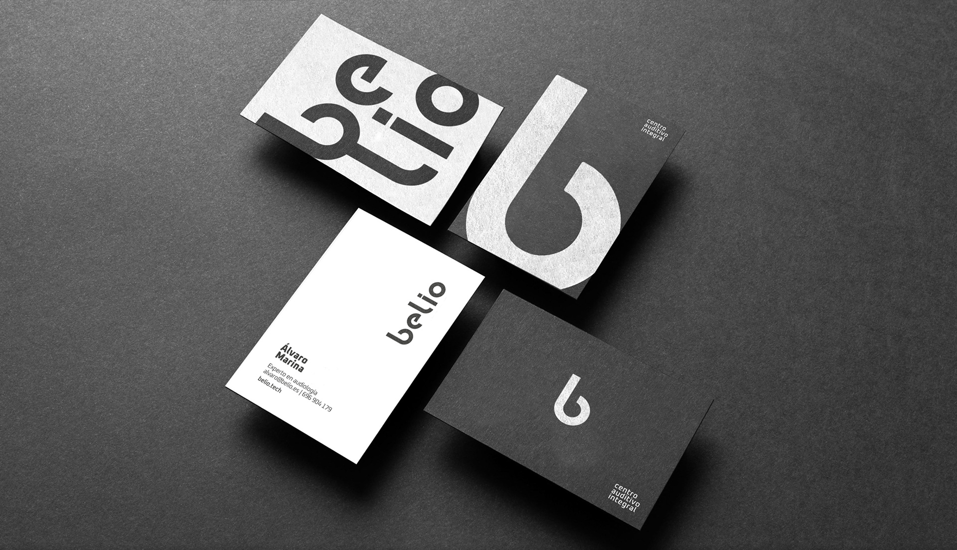
An identity that amplifies its purpose
Belio's image is carefully designed to convey innovation and approachability:
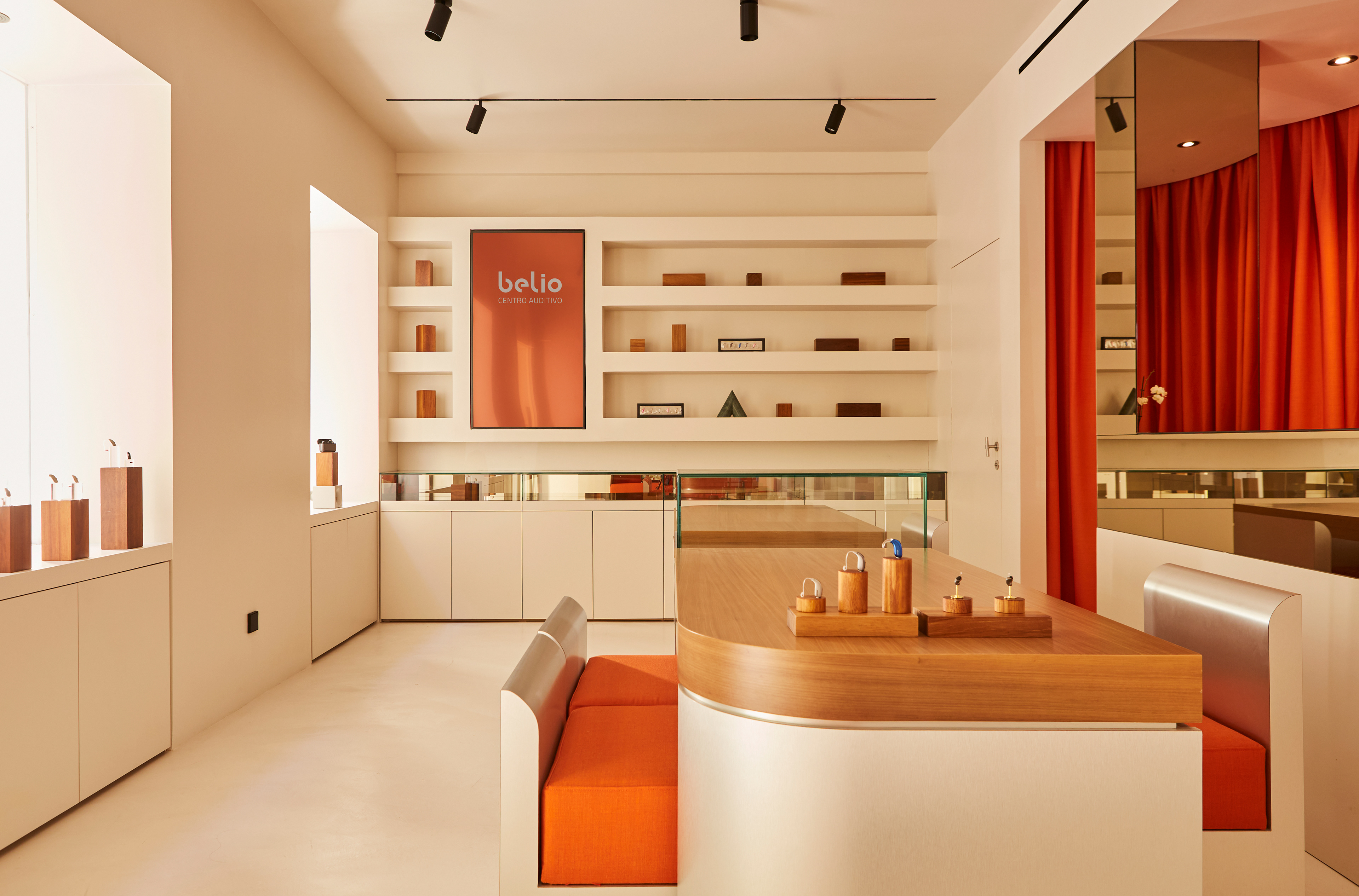
Bespoke typography, with rounded, clean shapes that evoke clarity, fluidity and simplicity. Each letter reflects the brand's transparency and human approach.
A monochromatic palette, where black and white not only add sophistication, but also reinforce the precision and purity of the message.
Minimalism with intention, eliminating distractions and focusing on the essential: a quality listening experience.
The result is an identity that combines modernity and accessibility, projecting confidence without the need for artifice.